Why Every Business Needs a Mobile-First Website
Why Every Business Needs a Mobile-First Website
In today’s digital-first world, one thing is clear: mobile is no longer secondary—it’s primary. From online shopping to service bookings, local searches to brand engagement, most user interactions with businesses now start on a mobile device. Yet surprisingly, many websites are still built with desktop as the default, treating mobile design as an afterthought.
That approach is no longer sustainable.
If your business doesn’t have a mobile-first website, you’re not just behind the curve—you’re actively losing opportunities, customers, and revenue. In this blog, we’ll break down what mobile-first design is, why it’s essential for every business (big or small), and how you can make the shift toward a mobile-optimized experience that drives results.
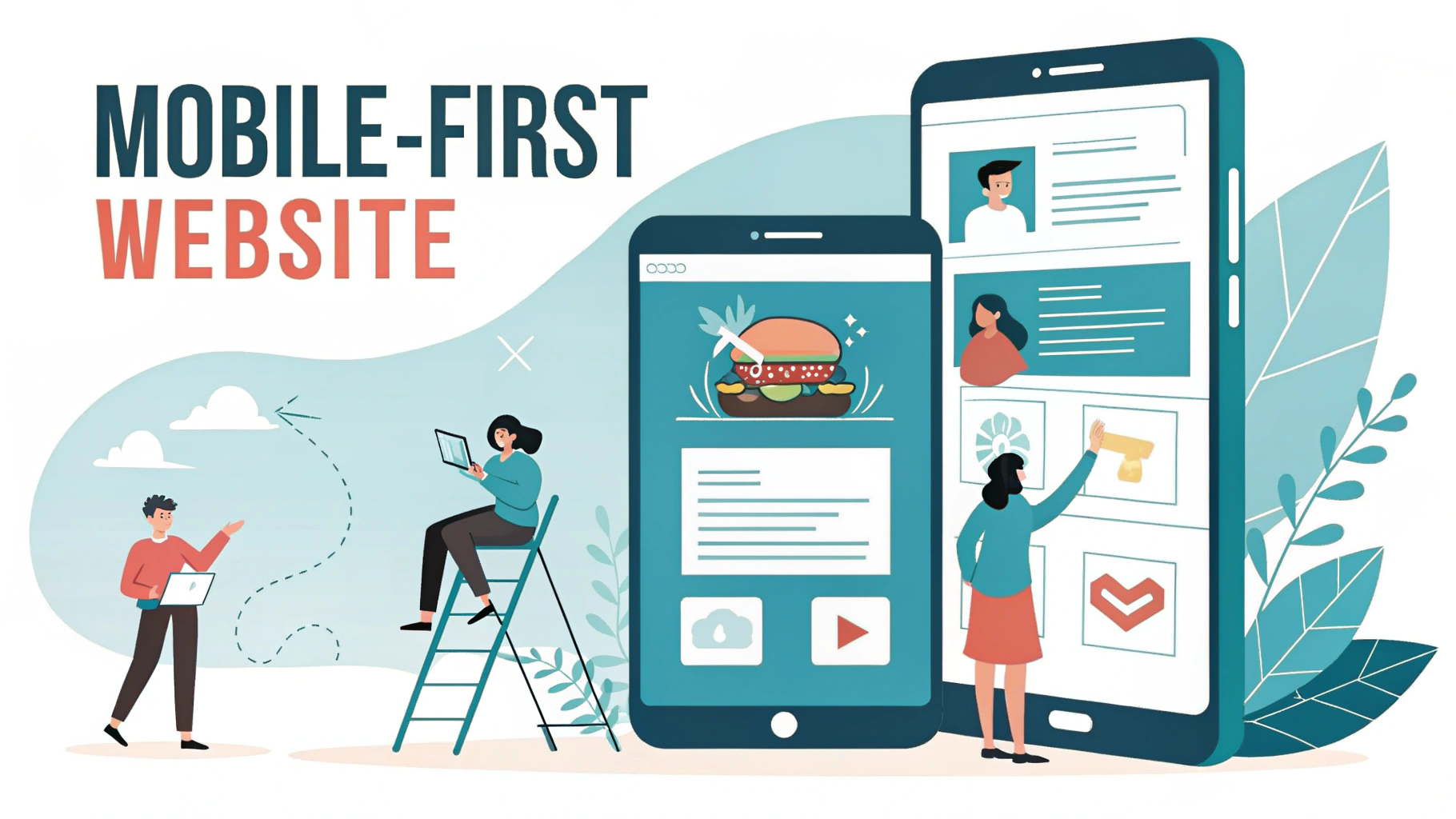
What Is a Mobile-First Website?
A mobile-first website is designed first and foremost for mobile users. It means mobile is the starting point—not a scaled-down version of your desktop site, but a carefully crafted experience optimized for small screens, touch gestures, fast loading, and on-the-go user behavior.
Once the mobile experience is perfected, designers then expand the site for tablets and desktops. This approach ensures a seamless experience for all users, no matter the device.
This is a shift from the older method of responsive design, where designers started with desktop and simply adjusted layouts to fit smaller screens. Mobile-first design flips that model on its head—and for good reason.
Why Mobile-First Matters More Than Ever
1. Mobile Traffic Dominates the Web
- Over 60% of global web traffic now comes from mobile devices.
- In some industries—like retail, hospitality, and food services—that number is even higher, often exceeding 70–80%.
- Google has switched to mobile-first indexing, meaning it primarily uses the mobile version of a site for ranking and indexing.
If your website doesn’t work well on mobile, you’re delivering a poor experience to the majority of your audience—and likely hurting your SEO in the process.
2. User Expectations Are Higher Than Ever
- Fast loading times
- Easy-to-read content
- Clear navigation
- Seamless functionality
- Instant gratification
According to Google, 53% of users abandon a mobile site that takes more than 3 seconds to load.
3. Mobile Influences Buying Decisions
- 79% of smartphone users have made a purchase online using their mobile device.
- 65% of consumers use mobile devices to look up price comparisons while in a physical store.
- Mobile users are more likely to act quickly, making same-day purchases after a mobile search.
The Business Case: How Mobile-First Impacts Revenue
- ✅ Higher Conversion Rates – Better usability leads to more action.
- ✅ Improved SEO Performance – Google favors mobile-friendly designs.
- ✅ Better Brand Perception – Clean mobile UX builds trust.
- ✅ Lower Bounce Rates – Keep users engaged and browsing longer.
- ✅ Wider Audience Reach – Meet your audience on their devices.
Common Problems with Non-Mobile-First Websites
- Tiny text that’s hard to read
- Buttons that are too small to tap
- Horizontal scrolling or misaligned elements
- Pages that take too long to load
- Pop-ups that block the entire screen
- Menus that don’t work on touchscreens
Key Elements of a High-Converting Mobile-First Website
1. Fast Loading Speeds
- Optimize images
- Minimize code and scripts
- Use lazy loading for media
- Choose a fast hosting provider
- Use a content delivery network (CDN)
2. Clear, Focused Content
- Short, punchy headlines
- Concise copy
- Bullet points and bold highlights
- One clear message per page
3. Easy Navigation
- Use hamburger menus
- Keep menus simple and short
- Ensure tap targets are large enough (at least 48px by 48px)
- Use sticky headers or back-to-top buttons
4. Thumb-Friendly Design
- Place CTAs within thumb reach
- Avoid elements too close together
- Optimize forms for mobile input
5. Mobile-Optimized CTAs
- Use contrasting colors
- Keep button text action-oriented (e.g., “Book Now”)
- Repeat CTAs throughout long-scrolling pages

6. Responsive Forms
- Use fewer fields
- Auto-detect and auto-fill info where possible
- Use drop-downs or toggles instead of free-text
Mobile-First Design vs. Responsive Design: What’s the Difference?
| Feature | Responsive Design | Mobile-First Design |
|---|---|---|
| Starting Point | Desktop | Mobile |
| Design Prioritization | Scales down | Scales up |
| Speed & Performance | Often heavier | Prioritizes light, fast assets |
| UX Focus | Secondary on mobile | Primary on mobile |
| Development Complexity | Retrofitting mobile | Built for mobile from the ground up |
Industries That Benefit Most from Mobile-First
- Retail / E-commerce
- Hospitality
- Health & Wellness
- Real Estate
- Food & Beverage
- Education & Coaching
How to Make the Shift to Mobile-First
Step 1: Audit Your Current Site
Use tools like:
- Google’s Mobile-Friendly Test
- PageSpeed Insights
- Hotjar or Crazy Egg
Step 2: Redefine Your User Goals
Design should reflect the top mobile user actions immediately.
Step 3: Design from the Smallest Screen Up
Start wireframing for mobile, then scale upward.
Step 4: Test Across Devices
Use responsive testing tools and real devices.
Step 5: Optimize, Analyze, Improve
Mobile-first is ongoing. Monitor and iterate.
Final Thoughts: Mobile Isn’t the Future—It’s the Now
There was a time when mobile-first was considered cutting-edge. In 2025 and beyond, it’s simply best practice.
If your website still feels like it was designed for desktops first, it’s time for a rethink. Because in a world where attention is short, competition is fierce, and mobile rules the screen—a mobile-first website isn’t optional. It’s essential.