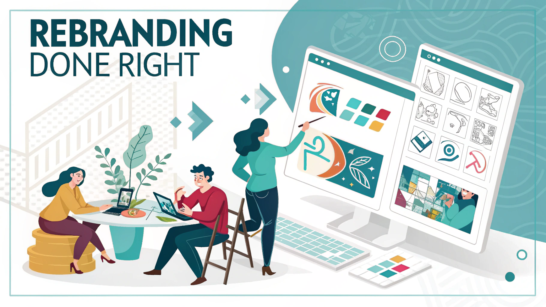
Rebranding Done Right: Lessons from Our Client Case Studies
Rebranding Done Right: Lessons from Our Client Case Studies
Rebranding is one of the boldest and most transformative moves a company can make. It’s more than just a new logo or color scheme—it’s a strategic evolution of a company’s identity, messaging, and market positioning. Done right, rebranding can ignite growth, reconnect with audiences, and revitalize your brand from the inside out.
At DreamsLab, we’ve had the privilege of guiding numerous clients through rebrands that didn’t just change how they looked—they changed how they were perceived. In this blog, we’re pulling back the curtain to share the behind-the-scenes of some of our most successful client rebrands, and the valuable lessons that emerged along the way.
Why Companies Choose to Rebrand
Before we jump into the case studies, it’s worth understanding why businesses consider rebranding in the first place. Some common triggers include:
- Outgrowing their original identity
- Mergers or acquisitions
- Entering new markets or industries
- Modernizing an outdated look
- Clarifying brand messaging
- Shifting target audiences
- Shedding negative associations or PR baggage
Whatever the reason, the goal is always the same: to create a brand that’s more aligned, more relevant, and more impactful.
Case Study #1: From Generic to Distinct — The Reinvention of CloudNova
The Challenge:
CloudNova, a SaaS company offering cloud storage and team collaboration tools, came to us struggling with a major identity crisis. Their original branding was generic, their website was text-heavy, and their messaging didn’t reflect the innovation they were bringing to the market.
They were competing with giants like Google Drive and Dropbox but lacked a clear voice or visual identity to differentiate themselves.
Our Solution:
We started with a full brand audit. What stood out immediately: CloudNova’s customer base loved their security features and ease of use, but none of that was showing up in their messaging.
We worked with them to:
- Redefine their brand positioning: “Secure cloud collaboration for teams who move fast”
- Redesign the logo: A sleek, geometric “C” shape that suggested both security and speed
- Choose a new color palette: Cool blues and energetic greens to blend professionalism with innovation
- Develop a bold, confident brand voice that focused on speed, control, and team empowerment
The Results:
- Website traffic increased by 40% in three months
- Customer retention rose by 18%
- They attracted two new enterprise-level clients within 60 days of relaunch
Lesson:
Rebranding isn’t just about design—it’s about rediscovering your value and projecting it with precision. Start by asking: “What do our customers actually value, and are we highlighting that clearly?”
Case Study #2: Evolving Without Losing the Heart — Willow & Co. Interiors
The Challenge:
Willow & Co., a boutique interior design studio, had built a loyal local following over ten years. But as they prepared to launch an e-commerce arm for selling curated home goods, their brand felt “too local” and lacked the polish needed to compete in the digital retail space.
They wanted to grow—but without losing the artisanal, personal feel their clients loved.
Our Solution:
We took a “refinement over reinvention” approach. Instead of a total overhaul, we evolved their brand elements:
- Updated their logo to a more elegant, simplified version while retaining the original leaf motif
- Refreshed their brand color palette with warmer neutrals and gold accents
- Introduced custom lifestyle photography and video to bring their brand story to life online
- Crafted a brand voice that was warm, design-forward, and conversational
We also helped them build a tone guide to ensure that all marketing—from newsletters to product descriptions—felt aligned with their evolved identity.
The Results:
- Online store launched with a 4-week waiting list
- Increased Instagram engagement by 60%
- Successfully transitioned from a service-only brand to a product-based revenue stream
Lesson:
Rebranding doesn’t have to mean starting from scratch. If your current identity holds equity, build on it. Evolution can be just as powerful as revolution.
Case Study #3: Shedding the Baggage — TerraBite Energy
The Challenge:
TerraBite, a clean energy startup, had received backlash for a confusing name that customers mistook for a tech or software company. They had also gone through internal leadership changes and needed to refresh their mission and identity to match their new direction.
Their brand felt misaligned with their sustainability-driven values—and trust was eroding.
Our Solution:
This rebrand was a reset.
- We renamed the company from TerraBite to Everlum Energy—a name that evoked light, clarity, and a sustainable future
- Built a completely new visual identity: earthy tones, sun motifs, clean lines
- Rewrote their mission, core values, and website copy to center around transparency, environmental impact, and community
- Created a “brand comeback” campaign titled “New Name. Same Mission. Brighter Future.” to reintroduce them to the market with honesty and transparency
The Results:
- A 35% increase in positive sentiment on social media
- Doubled their email subscriber list in 90 days
- Media mentions in three major clean energy publications
Lesson:
A rebrand can be a powerful tool to correct course and rebuild trust. But only if it’s authentic, transparent, and aligned with a clear new vision.

Case Study #4: Uniting Teams After a Merger — Forge + Frame
The Challenge:
After the merger of two creative agencies—Forge Studio and Frame & Co.—the newly formed team was struggling with a fractured identity. Internally, teams felt divided. Externally, clients were confused about the combined brand’s offering.
They needed a unified identity that honored both legacies while pointing toward the future.
Our Solution:
This was more than a visual rebrand—it was a cultural integration project.
- We conducted brand workshops with both legacy teams to extract shared values and future goals
- Designed a new logo that symbolized synergy: two abstract shapes “forging” together to create a frame
- Chose a flexible design system and messaging architecture that made room for multiple service lines (video, branding, digital design)
- Introduced a collaborative brand voice that emphasized creativity, partnership, and bold ideas
We also developed internal launch assets—swag kits, onboarding decks, and culture videos—to build internal buy-in.
The Results:
- Employee satisfaction scores rose by 25% within 3 months of relaunch
- Cross-selling between service lines increased by 40%
- Brand awareness grew by 70% in their target creative industries
Lesson:
Rebranding isn’t just outward-facing. The most successful rebrands start from within. Aligning your team is just as important as aligning your visuals.
Key Takeaways from Our Rebrand Projects
- Start with Strategy, Not Aesthetics
Too many businesses jump into logos and colors without deeply understanding who they are. Every one of our rebrands started with introspection: What do we stand for? Who are we serving? What’s the future we’re building? - Listen to Your Audience
Your customers, clients, and internal teams often hold the answers. Their feedback reveals what’s working, what’s missing, and where the brand can evolve. - Be Ready to Let Go
Sometimes, the hardest part of rebranding is releasing what used to work. Legacy elements can be nostalgic, but if they no longer serve the vision, it may be time to let them go. - Consistency Is Everything
Once the rebrand is live, every touchpoint—from social posts to email signatures—needs to reflect it. Inconsistency erodes trust faster than you think. - Brand Is More Than Visual
Logo, color, fonts—they matter. But voice, story, values, and experience? They matter even more. The best rebrands aren’t just pretty—they’re powerful.
Thinking of Rebranding?
Rebranding is a journey, not just a design sprint. It takes time, honesty, and the willingness to grow. But when it’s done right, it has the power to reposition your brand, reenergize your team, and reengage your audience.
At DreamsLab, we guide brands through every phase of transformation—from brand strategy to design execution, voice development to internal rollout. If you’re considering a rebrand, we’d love to help you do it right.
Because in a world full of noise, your brand deserves to be clear, confident, and unforgettable.