The 2025 Web Design Trends Your Brand Should Jump On
The 2025 Web Design Trends Your Brand Should Jump On
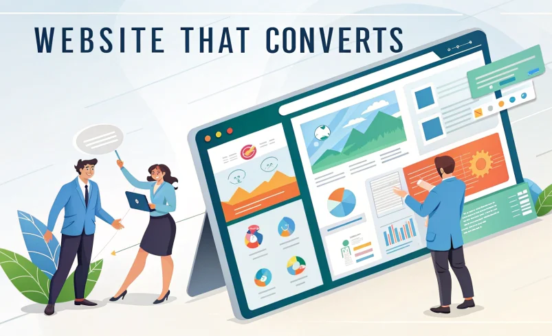
In the fast-paced world of digital design, standing still is falling behind. As we move further into 2025, user expectations are evolving faster than ever, and brands that want to stand out need to stay ahead of the curve. But here’s the thing—following trends isn’t about being flashy. It’s about staying relevant, functional, and emotionally connected to your audience.
Whether you’re planning a full website redesign or just looking to freshen things up, here are the top web design trends for 2025 your brand should consider jumping on.
1. Human-Centered Minimalism
What It Is:
Minimalism has been around for a while, but in 2025, it’s getting a more human, emotionally intelligent twist. Instead of cold, sterile white space, we’re seeing warmer tones, soft gradients, and calming micro-interactions that make users feel more comfortable and engaged.
Why It Matters:
People are overwhelmed by noise. A minimalist approach with thoughtful, human touches allows your message to shine without sensory overload.
How to Apply It:
- Use generous white space for readability.
- Choose neutral or muted tones paired with soft textures.
- Focus on one clear message per screen.
- Make every click, hover, or scroll meaningful.
2. AI-Powered Personalization
What It Is:
Thanks to rapid advancements in AI, websites can now personalize the user experience in real-time—offering content, recommendations, layouts, and even visuals based on user behavior, preferences, or data profiles.
Why It Matters:
Users expect more than a one-size-fits-all experience. Personalization increases engagement, time on site, and conversions by making users feel seen and understood.
How to Apply It:
- Show tailored product recommendations or blog content.
- Use smart chatbots for real-time assistance.
- Customize layouts or calls-to-action based on location, time of day, or browsing history.
- Use AI to dynamically adjust messaging to match user intent.
3. Motion That Tells a Story
What It Is:
Subtle, purposeful animation is becoming an essential storytelling tool. From scroll-triggered effects to loading transitions and hero section animations, motion is bringing static pages to life.
Why It Matters:
Motion guides the user’s journey, draws attention to important areas, and adds delight without being distracting.
How to Apply It:
- Use micro-interactions (e.g., button hover effects, loading dots).
- Animate content on scroll to encourage deeper exploration.
- Create storytelling sequences in your hero sections using Lottie files or CSS animations.
- Avoid overdoing it—motion should support the content, not overshadow it.
4. Immersive 3D and Augmented Reality Elements
What It Is:
With better browser support and faster internet speeds, 3D visuals and augmented reality (AR) are becoming more practical on the web. Interactive product demos, 360-degree tours, and virtual try-ons are just the beginning.
Why It Matters:
Immersive visuals capture attention and improve understanding—especially for complex or tactile products.
How to Apply It:
- Use 3D product visualizers in e-commerce.
- Add interactive AR features (e.g., “See it in your room” furniture tools).
- Use WebGL or libraries like Three.js for interactive design elements.
- Be strategic—use 3D/AR when it adds value, not just for novelty.
5. Voice User Interface (VUI) Integration
What It Is:
As voice search and voice-activated devices become more common, websites are starting to integrate VUI elements—allowing users to navigate or search using their voice.
Why It Matters:
Voice is more natural and accessible for many users. It also improves the overall UX for mobile and differently-abled users.
How to Apply It:
- Integrate voice search for content-heavy or e-commerce sites.
- Use voice guidance for tutorials or onboarding flows.
- Make sure your content is optimized for voice queries (think long-tail, conversational keywords).
6. Sustainable Web Design
What It Is:
Sustainable web design focuses on reducing the environmental impact of websites by optimizing performance, minimizing energy usage, and designing with longevity in mind.
Why It Matters:
Users—and Google—are increasingly prioritizing brands that care about the environment. Lean, energy-efficient websites load faster and offer a better UX too.
How to Apply It:
- Optimize images and compress files.
- Use clean code and fast hosting providers.
- Limit third-party scripts and plugins.
- Design for dark mode (which can reduce energy use on OLED screens).
- Be intentional—fewer pages, more value.
7. Typography as a Hero Element
What It Is:
In 2025, typography isn’t just supporting the design—it’s becoming the design. Large, expressive fonts are being used in hero sections, headlines, and even as navigational elements.
Why It Matters:
When used creatively, typography can set the tone for your brand and improve scannability while making a bold visual statement.
How to Apply It:
- Use bold fonts with strong contrast for headlines.
- Mix fonts carefully (limit to 2–3 maximum).
- Experiment with kinetic typography (animated text).
- Prioritize readability across devices and screen sizes.
8. Accessibility-First Design
What It Is:
Accessibility isn’t just a checkbox anymore—it’s a core design principle. Brands are embracing inclusive design to make their websites usable for people of all abilities.
Why It Matters:
Over 1 billion people live with a disability. Accessibility also improves SEO, usability, and customer satisfaction.
How to Apply It:
- Ensure high contrast between text and background.
- Use alt tags on all images.
- Make your site navigable via keyboard.
- Add transcripts for audio/video content.
- Use ARIA labels and semantic HTML.
- Test with tools like WAVE, Axe, or Lighthouse.
9. Brutalist-Inspired Layouts with a UX Twist
What It Is:
Brutalist web design—known for its raw, asymmetrical, and unconventional look—is evolving. In 2025, it’s being softened with better UX, responsive layouts, and strategic typography.
Why It Matters:
It helps brands that want to stand out and appear bold, edgy, or unconventional—while still delivering a smooth experience.
How to Apply It:
- Use unexpected grid layouts with purpose.
- Combine bold colors and type with minimalist navigation.
- Focus on UX first—then add creative flair.
- Ideal for creative agencies, fashion brands, and Gen Z-focused sites.
10. Dark Mode and Color Theme Toggle
What It Is:
Dark mode has gone from trendy to essential. Giving users the ability to toggle between light and dark themes is now a standard feature in high-end web design.
Why It Matters:
It’s easier on the eyes, can reduce battery consumption, and adds a premium feel to the user experience.
How to Apply It:
- Design a full dark mode version of your site—not just an inverted color scheme.
- Use toggle switches with smooth transitions.
- Test legibility and color contrast in both modes.
11. Emotionally Intelligent Content Design
What It Is:
Web content is becoming more empathetic and emotionally aware. Brands are being more conversational, inclusive, and personal in their language—especially in error messages, onboarding, and microcopy.
Why It Matters:
In a world where AI writes everything, human-centered content stands out. It builds trust and loyalty.
How to Apply It:
- Use conversational tone and second-person voice (“you,” “your”).
- Write helpful, human-centered error messages.
- Inject brand personality into CTAs and confirmation pages.
- Use inclusive language throughout your site.
12. Component-Based Modular Design
What It Is:
Instead of designing every page from scratch, designers are building modular design systems with reusable components (cards, buttons, blocks). This approach supports consistency and scalability.
Why It Matters:
It reduces design debt, increases development speed, and allows for flexible layout experimentation—ideal for brands that evolve quickly.
How to Apply It:
- Build a consistent component library (design system).
- Use Figma or Adobe XD to create scalable UI kits.
- Make sure each component is responsive and accessibility-friendly.
- Work closely with developers to bridge design-to-code gap.
What to Avoid in 2025
- Over-designing: Flashy doesn’t mean functional. Trends should enhance UX, not overshadow it.
- Using AI blindly: Leverage AI with intention, not just for novelty.
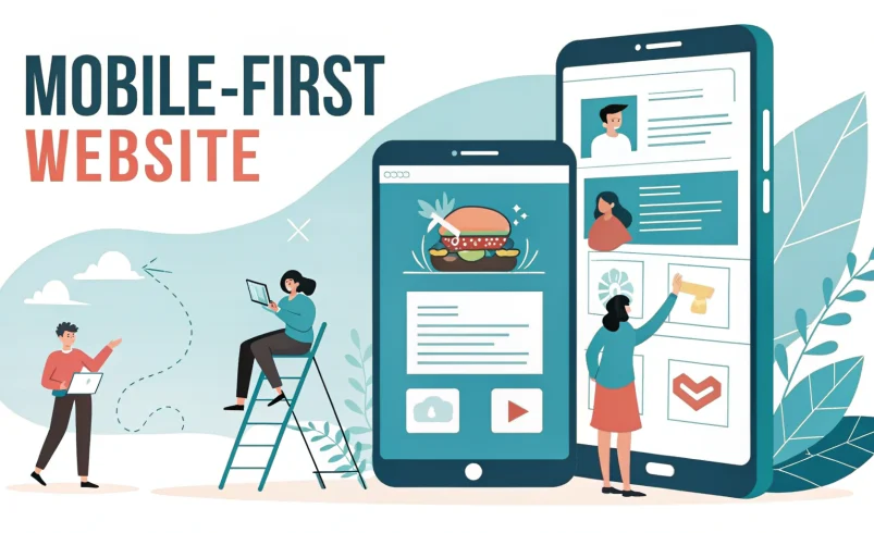
- Neglecting mobile-first: Mobile traffic continues to dominate. If your site looks clunky on phones, you’re losing users.
- Forgetting the “why”: Every trend should serve a purpose—don’t use 3D or motion just because it’s cool.
Final Thoughts
2025 is shaping up to be a year where personalization, empathy, and functionality take center stage. Web design isn’t just about creating beautiful layouts—it’s about creating experiences that feel intuitive, inclusive, and aligned with your brand values.
To stay ahead:
- Watch your data.
- Listen to your users.
- Experiment boldly.
- Stay rooted in strategy.
And remember: The best web design trends are the ones that work for your audience.